It seems like with increasing frequency we hear about rising inequality, both with wealth and income distribution across our country and the world as a whole. We see articles regularly like this and this, accurately describing it as a major issue for our times.
With so much interest in the topic, it’s probably unsurprising that it’s a well-studied field. Before you can properly wrap your head around something you have to measure it, and in order to get policy makers to pay attention you pretty much have to boil that measurement down to a single number. So it isn’t shocking at all that economic inequality can be measured by a single value, known as the Gini Coefficient.
I Dream of Gini
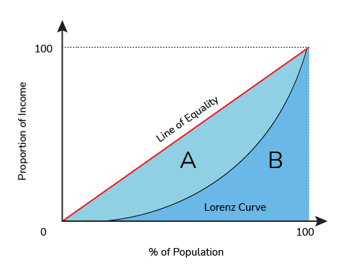
To start looking at measuring inequality we can survey a population, rank people based on their wealth, and compare the percentage of people poorer than a given person to the percentage of wealth held by people poorer than that person. Effectively, these two values will be identical in a purely even distribution but further apart as the inequality starts to grow. If everyone has the same wealth, then the poorest 20% of the population will have 20% of the money, and the poorest 70% will have 70% of the money. If we plot this, we’d get a straight line of equality:

A more unequal distribution might look like this, though, where the poorest 20% only has 5% of the wealth, and the poorest 70% only has 50%:

The Gini coefficient compares these two curves, the equality curve and the actual curve of the population, by comparing the area under the actual curve (B) to the area between the curve and the line of equality (A). The bigger the area between the curves (Area A), the bigger the Gini coefficient, so a Gini of 0 means a perfectly equal society, and a Gini of 1 means effectively that all the wealth is concentrated in the hands of one person.
Gini in a Bottle
The Gini coefficient isn’t a perfect way of measuring inequality, but does a pretty good job. In the absence of social programs like a universal basic income, it’s worth pointing out that there will probably always be a non-zero Gini income coefficient, and that that’s not inherently evil. For instance, people late in their careers tend to make more money than newborn infants, and we’re generally ok with that.
The Gini coefficient also could give the same number to different distributions, if the shape of the curve is different but still results in the same relative areas. This means that overall it’s better as a relative indicator of inequality than a pure comment on the status of a society.
Unleash the Gini
As a very basic example for figuring out a Gini coefficient of our very own, we can take a look at a 10 player “Sit n Go” poker tournament. Following a common model used in online tournaments, 10 players sign up and the winner gets 50% of the pot, second place gets 30%, and third place gets 20%. Everyone else gets nothing, though hopefully has lots of fun too.
If we wanted to plot the curve we talked about before (incidentally, called a "Lorenz Curve"), we could use the information that the bottom 70% (the 7 losers) get 0% of the wealth, the bottom 80% (7 losers + third place) own 20% of the wealth, and the bottom 90% own 50%. Put that all together and we get this graph:
 |
Area A, between the curves, can now be compared to the total area of A+B, and we get a Gini coefficient of 0.76.
Before we get to the actual point of all this, it’s worth taking a second to reflect here. Splitting a population into ten groups and having 50% of the wealth go to the group that's best at poker is no basis for a system of distributing wealth. That's 50% of all cash, stocks, bonds, houses, privately held land, and super yachts. Extending the analogy, even if we were to pretend that the "best" 10% is who ends up with half the wealth, where here poker ability might correspond to concepts like hard work, diligence, education, etc, that still feels raucously unfair to end up with a distribution as shown above. And that's ignoring the fact that a significant proportion of wealth is significantly correlated to the wealth of one's parents, negating a lot of the 'hard work' argument.
So here's the issue. The Gini coefficient for the distribution of wealth in a 10 player online poker tournament is 0.76. The Gini coefficient for the distribution of wealth in Canada is 0.73.
Now on the one hand, admittedly there's a little bit of room between 0.73 and 0.76. 0.76 is about the same relative inequality as in Vietnam, a bit worse than a country like Egypt (0.756) and a bit better than a country like Bolivia (0.764).
On the other hand, Canada is about the same as countries like Uganda and Liberia, which may come as a surprise to some overly self-righteous Canadians. As well, the most recent statistics are from 2019, and studies show that inequality has only risen during the Covid-19 pandemic.We very well could be worse off than if our society had been set up as though by poker tournament.
Another thing to mention is that, as I said before, the Gini coefficient doesn't really comment on the shape of the Lorenz curve, just the area. And obviously Canada doesn't have 70% of people with absolutely no wealth, so maybe while the numbers are similar they don't mean the same thing, maybe it isn't quite as dire as it sounds?
Unfortunately it's not that simple. A 2012 report from the Broadbent Institute showed this graph for Canada:
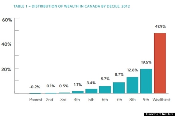
Shockingly, the top 10% (at that time) ended up with almost half the wealth, not far off from the poker example. The bottom 10% didn't just have “no wealth”, they owed more than they owned. I'd argue that if you want to think about just how rich the rich are in Canada, a 10 person poker tournament is, distressingly, actually a very good analogy.
As an aside, at least in terms of poker analogies, things can always get worse. The $10,000 Main Event at the World Series of Poker handily posts its payout table online, and if you do a similar analysis you get something much much worse:

This Gini coefficient comes in at a whopping 0.94, thankfully much higher than any real country. This is what a Lorenz curve looks like when 0.5% of the population has 50% of the wealth, and is genuinely terrifying to contemplate as a future if we don't sort things out in the real world.
Canada has a long way to go in terms of wealth inequality, but obviously it gets worse too. The United States (0.852) and Russia (0.879) have absurdly high wealth inequalities. But worst of all? The world as a whole, sitting at a Gini coefficient for wealth distribution of 0.885. We have the means to measure this and the tools to do address it, and it's well past time we do something about it.