Friday, October 9, 2015

Electoral Reform

In less than two weeks we're going to head to the polls and elect the 42nd Government of Canada. The elections process we use is pretty old and potentially outdated, and it's time that we started to take a proper look at how it works.

A quick overview of what we currently have: on October 19th, you and the ~100,000 people who live closest to you will have the chance to pick who represents you at the House of Commons. Whoever gets the most votes between you and your neighbors wins, and becomes a Member of Parliament.
Now, most candidates in each riding are associated with a political party. When they all get to the House of Commons, they tend to stick together with other people of their party, and most of the time vote the same way. Once everyone has gotten to the House of Commons, the Governor General (representing our Head of State, the Queen of England), offers the leader of the largest elected party the opportunity to form a government, which is subsequently voted on by all members of the House. 
Unless you happen to live in a riding with the leader of a major party, you never actually directly vote for who is going to be prime minister or how powerful of a government that leader will have. 
If the largest party has more than half of the seats (a majority), they'll win this vote pretty easily and form government. If they don't, they can still form government by arranging deals with other parties, but probably won't stick around for too long. 

Our system of electing people to represent us has its share of failures. For one thing, as a representational democracy, you'd hope that everyone is equally represented in the House of Commons, but this isn't necessarily the case. In fact, the riding with the fewest voters (Labrador - population 26,728) has almost 5 times less population than the riding with the most (Brantford-Brant, population 132,448). This means that a voter in Labrador has 5 times the voting power of one in Brantford. The full distribution of voters per riding looks like this:


This is actually really badly distributed, and the problem is serious enough that there are often laws in place to prevent this sort of thing from happening. In Alberta, for instance, the Electoral Boundaries Commission Act limits population deviation between provincial electoral divisions to 25% of the average. Provinces like Saskatchewan and New Brunswick limit deviation from the average to only 5%, but in federal elections the largest deviation is an overwhelming 73% below average.

(Before you despair, though, keep in mind that the US Senate assigns the same number of senators per state regardless of its population. The best-represented US senate voter has 66 times the voting power of the worst-represented, and the largest population per senate seat is 510% of the average.)

So our system isn't really all that great at ensuring that everyone's vote is worth the same, but is it any good at reflecting people's voting choices?

Not entirely. At a small scale, the winner of any given riding is indeed the candidate with the most total votes, but more often than not they don't win with a majority of votes. Over the last three years, 58% of seats have been won with less than 50% support, and the worst winner became an elected Member of Parliament with only 29.1% support.


This in and of itself isn't inherently evil, but our system is designed to elect representatives for each riding, and it is hard to argue that someone with less than 50% support is always the most representative of the area. The worst case situation I mentioned earlier had a Bloc Quebecois member elected with 29% support, but if the elected MP were to vote on the issue of Quebec separation, should he listen to the 29% of people who supported him, or the 71% of people who voted for explicitly non-separatist candidates??

Most issues that MPs vote on aren't that white-or-black, of course, but it's not unreasonable for MPs to be put in positions where their party line disagrees with the majority opinion of their constituents, and this is not an effective form of representational democracy.

This leads to one of the biggest issues with First Past the Post electoral systems - they are prone to dishonest or strategic voting. In our current election, there is a push from multiple groups to coordinate voting in swing ridings, with the mindset that it's better to vote against a specific party than to vote for a party you actually care about. Any seat that is won with less than 50% support can be prone to strategic voting, especially if voters either don't feel their preferred candidate has a chance to win or if voters are particularly angry at the front-runner.

When we zoom out a bit, though, this lack of majority support per riding can lead to larger effects on a reigonal scale. If a region of five ridings has an evenly-distributed population with, say, 40% support to one party and 30% support split between each of two other parties, the party with 40% could easily end up with candidates elected in a majority of ridings and take control easily (if that party has control of setting electoral boundaries, they can potentially do this even without being the most popular by gerrymandering).

This is the issue of (non-geographic) proportional representation, and on a national scale our elections haven't always turned out terribly proportionately. In fact, the last four elections look like this:


For the last four elections, the parties that contested all available seats (hence the lack of Bloc Quebecois in the graph, they're silly anyway) have actually very neatly traced a cubic relationship between party support and seat allocation, instead of the line that we might expect.

Before I talk about proportional representation too much more, I'd like to acknowledge a key assumption about proportional representation: it is often assumed that a voter for a candidate from a party in one region supports that party in all regions. This is definitely not always the case - I personally have voted for candidates while disliking their party leadership, and have known others to vote strictly based on candidate and not on party at all. When people argue that a party with 40% voter support should get 40% of the power in the House of Commons, that is definitely not the motivation that has driven all of those votes to have been cast in the first place.

Nevertheless, there are certainly benefits to having a system where party power post-election reflects party support. Much like an individual MP being elected with less than half of the support of their riding, the above graph shows that it's likely (and has certainly happened in the past) for parties to end up with a majority government with less than a majority of voters' support.

Hopefully by now I've shown that there are issues with the current first past the post system that we have in Canada. Not everyone's votes counts at the same value, and once they've been counted we're not represented to the best extent possible.

There are three leading proposals out there that are being put forward for how to deal with some of the shortfalls of our current system that are worth discussing: Alternative Voting (AV), Mixed Member Proportional (MMP), and Single Transferable Vote (STV). There are, of course, hundreds of ways that we could change our system, but these three have a history of being considered in Canada, and are worth taking a closer look into.

Alternative Voting

AV (also called Instant-Runoff Vote) isn't officially being proposed by a political party right now, but is apparently a leading possibility in the Liberals' current plans to overhaul the electoral system.

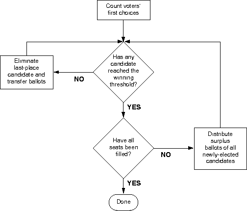
When voting in an AV election, every voter has the choice to rank as many candidates as they want. All voters' first choices are added up, and if any candidate has over 50% of the votes they win. If nobody has enough, then the candidate with the lowest first-place votes is eliminated, and all votes for them are redistributed to the second-ranked choices. This process continues until eventually one candidate has over 50% of the vote and wins.

Source
If we were to replace our current system with Alternative Vote tomorrow, the results in ~42% of our ridings would definitely not change at all, as historically about that many seats have over 50% support to one candidate anyway. Only ridings with very close first-round results would be likely to end up differently between FPTP and AV election systems - quite often the front-runner off the first-choice votes ends up winning.

So why is Alternative Vote any better than First Past the Post? Mainly because it reduces the need of strategic voting. If your favored candidate is unlikely to win, you don't have to consider a vote for them wasted, because either the winner will win with over 50% support (and you couldn't have changed it anyway), or your vote will get redistributed to someone else of your choice. This is good inasmuch as it allows voters to vote with their conscience.

On the other hand, all the rest of the problems that exist in First Past the Post still exist in Alternative Vote. An analysis of the 2015 UK election, for instance, suggests that the results would have been even more disproportionate under AV than FPTP, and while it's true that voters can't be left with a candidate winning with 30% support, if the 50% benchmark is hit through a series of second, third, or fourth-place votes then we still have a situation where the majority of voters never picked their representative, or only picked them as a compromise solution. Keeping a system of single-winner ridings with a minimum 50% support doesn't ensure proportionality at all.

Mixed Member Proportional

MMP has been proposed by the NDP as an election promise this year, to be implemented by the next election. It has been proposed by the Law Commission of Canada and independent provincial commissions, but has also officially been rejected by the voters of Ontario in 2007.

Youtube again does a very good job of explaining it here, but the quick explanation is that when a voter goes to vote in an MMP system, they get two ballots. One is the exact same as our current ballot, and the other is strictly for party preference. After all votes are cast, whoever ends up with the most votes in each riding from the first ballot gets elected, just as normal.

After that, the proportion of party support received off the second ballot is compared to the number of seats won from the first ballot, and additional seats are filled from pre-existing party lists until the overall proportion of seats in the House of Commons matches the proportion from that second ballot. Overall, half of the seats in the House of Commons would be filled by each ballot.

Source

MMP is touted as providing a good balance between keeping geographical representation, while guaranteeing partisan proportionality and avoiding the need for strategic voting. However, it misses the mark on most of these.

The issues mentioned before regarding First Past the Post winners not representing a large proportion of their constituents absolutely have not disappeared in MMP - this would leave the same number of voters without a local representative in parliament as before. Strategic voting for or against candidates at a local level would still occur too - in fact, MMP is at best a half fix from First Past the Post, since half of the ballot takes place in the exact same way as always. (It may be worse than FPTP, since the directly-elected MPs would be responsible for ridings double in size from previous ones, in order to make room for the new list-only MPs.)

So let's focus on the second half of the ballot. By filling seats based on a candidate's ranking on a party list, instead of electing them directly, a whole second class of MP would be created. These MPs wouldn't be accountable to any citizens or have to represent them, since they would owe the existence of their jobs solely to the popularity of their party.

In my opinion, this is less of an issue in countries that currently use MMP, like New Zealand, Germany, and Scotland, than it is in Canada, mostly because combined those three countries cover an area only a little bigger than Alberta. If a party ends up being elected largely without direct constituency seats, then their MPs in the country capital may not be the best suited to debate issues taking place thousands of kilometers away as opposed to only hundreds of kilometers away. The lessened importance of geographical representation in MMP becomes more of an issue when your country sprawls across five and a half timezones.

The second ballot of MMP also isn't immune from strategic voting. For instance, in the 2005 Albanian election the two major parties convinced their supporters to vote for them on the constituency ballots, and to vote for smaller coalition partner parties on the party ballot. This resulted in an unbalanced situation where previously tiny parties shared all the party ballot seats, and the large parties shared the constituency seats, and a pre-determined coalition took control. Similarly, in the 2007 Lesotho election, the major parties split in two and used decoy parties for the list seat votes. This example of gaming the system resulted in one party taking 69% of the seats with 52% of the vote.

Obviously these are in the past and the development of a new electoral system could hopefully take steps to avoid loopholes like this, but other concerns still exist. MMP ballots tend to fall into two camps - open lists or closed lists. A closed list would trust the parties to fill in their top-up seats at their discretion, creating the possibility of career politicians who keep getting elected based on value and loyalty to the party, whereas an open list (as favoured by the NDP) would have voters choose the list of MPs-to-be. Needless to say, this option would take a "simple two ballot" system and add an enormous amount of ranking to it.

Mixed Member Proportional voting system tries to be the best of both worlds, but doesn't necessarily excel at either. Its local representation has all the issues we already have, and its push for proportionality creates a second class of MP with questionable accountability. Both MMP and AV appear to be half solutions to the current issues with FPTP, but they seem to address separate halves of the issue.

Single Transferable Vote

STV was recommended by the Citizens' Assembly of British Columbia in 2004, and got 57.7% percent support in a 2005 referendum. But the BC government said they wouldn't be bound by anything lower than 60% support, campaigned hard against it, and when it came back to referendum in 2009 it only got 39.1% support.

Yet again, Youtube has a good explanation, but what happens in STV is that ridings are merged together, with several winners getting elected from each riding. Because of this, each party can nominate multiple candidates. Voters then rank as many candidates as they want in each riding.

Based on the number of seats to be filled in each new riding, a minimum threshold of votes is needed to get elected. Then an adapted version of Alternative Vote takes place - any candidates with more than that the threshold are elected, and their surplus votes are redistributed at a fractional value to the next-ranked choices. This repeats until no candidate has reached the threshold, at which point the lowest-ranked candidate is eliminated, and voters' subsequent choices are redistributed at full value.

Source
The use of fractional vote redistribution for winners ensures that voters who pick popular candidates aren't penalized. If a majority of the population all pick candidates from Party A, then effectively the most popular candidate from the party will share their surplus votes to voters' subsequent choices, so that voters don't have to worry too badly about the order in which they rank multiple more-or-less equal choices. Similarly, candidates who are eliminated have their votes redistributed at full value so that their voters aren't penalized either.

So how does this fix anything? Well first of all, the issue in FPTP where people could feel unrepresented is very nearly eliminated. Imagine a riding that elects five MPs - in this case, each MP would need 16.67% of the vote (plus one vote) to get elected. This is the minimum threshold that five MPs could each hold, but that six people couldn't (because of the +1 vote requirement). This means that, at the absolute worst case scenario, 83% of everyone's ballots would go directly or indirectly towards electing someone, and almost always the people elected would be the first or second choices of the voters.

Strategic voting would no longer be an issue. Unlike FPTP, if a voter's preferred candidate doesn't get elected, that isn't going to jeopardize the chances of a compromise candidate. Voters could vote with a clear conscience, and smaller parties would not have to worry about losing votes to strategic coordination.

Also, the more seats there are in each riding, the closer to proportional the overall result would become. If 40% of people vote Party A in a 5-person riding, then only the two most popular Party A candidates will get elected, and all the votes cast for Party A candidates won't be redistributed anymore because they've succeeded in getting seats filled. Smaller parties will have a better chance of getting elected by the popularity of individual candidates, as the threshold to get elected to a multi-seat riding will be lower.

While the national results will be very close to proportional, proportionality isn't the end-goal of STV like it is in MMP. That means that voters who vote based on party affiliation can lump their ranking by party, but voters who vote based on candidates would be free to do so as they wish.

STV keeps geographical representation and proportional representation. So why isn't it being proposed by any major parties?

Well for starters, those reports I mentioned before supporting MMP were a bit weakly worded. The PEI report liked both systems, but felt that MMP would be easier to swallow for Canadians since it's only changing half of the system (pg 98). The Law Commission report considered STV for about half a page (pg 103) before rejecting it based on it not having "geographical representation ... effective/accountable government ... [or] regional balance" without explanation. To their credit, neither the Liberals nor the Green Party have dismissed STV, and instead officially are proposing to form committees to investigate the best way forward.

Most complaints about the STV system are that it is complicated to explain and results in long ballots. These are definitely true, though as mentioned before an open list MMP system would likely have a similarly long ballot, and the idea of ranking people is the same as in AV. STV is also certainly not the most complicated voting system out there, but often the complications are required to avoid strategic voting openings.

Canada's electoral system is old and showing some signs of wear and tear. Both the disproportionate and inadequate representation that we have in our current system can and should be fixed, and the sooner that this happens, the better. But we don't have to accept only the Alternative Vote being entertained by the Liberals or the Mixed Member Proportional system offered by the NDP - they are at best half a fix, and at worst no better than our current system. If we're going to fix this, we should do this right.

Friday, August 7, 2015

Fortune Favours the Old

I had my birthday recently and, much like last year, got a joke present from a friend. This year though, it came with an explicit challenge to do something statistical with it. So for this blog post, my subject matter will be based on this box of fortune cookies:

My willing victim

So what stats can be pulled out of a box of fortune cookies? First of all, I suppose the box says there are approximately 25 cookies, but in reality it came with 38 fortunes. Ridiculous quality control, let me tell you!

Of course, most fortunes just floated around without cookies
Fortunately, each fortune has a set of numbers on the back. Numbers are good, so let's do stats with those and leave the yummy cookie bits for later.

Fortunes not necessarily to scale.
Each fortune has a series of 6 ascending, non-repeating integers on the back. Presumably these are lucky numbers for your next lottery, but given just this set of numbers we can't necessarily tell which lottery they might be meant for. But can we make an educated guess?

Quick history lesson: in World War II, the Allies were at least somewhat concerned with estimating how many tanks Germany was building in any given month. One way they had was conventional espionage, which suggested that the Germans were building approximately 1,400 tanks every month between June 1940 and September 1942 (a lot of tanks). Of course, spies sometimes lie (it's their job, after all), so the second way the Allies had to estimate tank production was using statistics on captured tanks.

Every tank had a whole bunch of parts, and every part had a serial number stamped into it during production. These serial numbers were unique for every tank, and in the case of the gearboxes in particular, fell in unbroken sequences. Based on the distribution of serial numbers, a relatively simple formula could give an estimate of the total number of tanks produced. For instance, if the Allies saw that the tanks they destroyed in a given month were tanks produced #25, #94, #141, and #198 of that month (and were confident they were destroying them randomly), they'd be much less worried than if they destroyed tanks #52, #306, #519, and #1058.

It actually turned out way more accurate than anyone hoped - statistical estimates for tank production between June 1940 and September 1942 were 246 tanks per month, and in reality the Germans produced 245. Yay stats!

So like the famous German tank problem, looking at a fortune cookie's string of numbers can give us an estimate of the total number of 'lucky numbers' that the fortune cookies might offer. In the above example, there are 6 numbers decently evenly spaced between 2 and 47. A frequentist statistical approach, therefore, suggests that the total number of possible numbers that could be on the backs of these fortune cookies is 53.83, with a 95% confidence interval of 47-77. Not terribly precise when looking at a single fortune. Another fortune might have a series of numbers with a likely maximum of 48, for instance, and if we look at the average of all 38 fortunes in the box, the average 'expected number' ends up being 49.4. And in fact, of all 38 fortunes, all numbers on the backs were between 1 and 49.

So we have six numbers, chosen between 1-49. Sounds like we're playing Lotto 6/49!

Here's what the distribution of all lucky numbers ended up being:


It kinda looks like number 37 comes up way more often than the rest, and numbers 9 and 13 are super under-represented. Is this a conspiracy, or random chance?

With 49 numbers to choose from, 6 different numbers on each fortune, and 38 fortunes to choose from, we'd expect an average of 4.65 of each number to show up. With an expected 4.65 of each number, we can create a Poisson distribution to see how often we'd expect any given number to turn up, and see if ours is indeed random. That'd give us something like this:


This suggests that the distribution of lucky numbers isn't actually all that lucky, and may be pretty much what you'd expect (R2 value of 0.82, which ain't shabby). It matches particularly closely at the tails, so having a few numbers occur 10 times each isn't all that surprising really.

One last analysis for the fortune cookies. Fortunes tended to come in one of three categories: advice ("Counting time is not as important as making time count"), analysis ("You are deeply attached to your family and home"), and most popularly predictions ("You will soon find something lost long ago"). Is there any relation between the type of fortune on the front, and the sum of the numbers on the back?


Nope, nothing statistically significant anyway. The Analysis fortunes seem to generally have higher numbers on the back, but there are too few of them and they are too varied to be conclusive.

So there you go! Fortune cookies tend to have Lotto 6/49 numbers on the back that are fairly well randomly distributed. Not sure if that left any of you particularly surprised, but it's fun to know nonetheless!


Wednesday, July 15, 2015

Canadian Inequality 2: Revenge of the CCPA

Like last year, the Canadian Centre for Policy Alternatives has come out with a ranking of the "The Best and Worst Places to be a Woman in Canada." Since I got so frustrated with the last one, I figured I'd do a quick follow-up on this one:

The Good


  • Cities are given an inequality score on each category, then the scores are averaged for each to come up with a final score, which is then ranked. This is a vast improvement on last year, where they were ranked within each category, then their ranks were averaged, as the variations within categories change quite drastically. This was one of my biggest issues with last year's report.
  • Within each category, sub-indicators are weighted according to their variance. This was used in other similar studies before, and is helpful at revealing actual differences between cities.
  • No weird ranking arithmetic errors in the appendices!

The Bad


  • Some news sources seem to be suggesting that Victoria has 'risen' in the rankings this year. Nope - this is essentially a completely different yet topically similar study, with a different sample size, new measures, and different methodologies. Consider this a re-do of the previous study, especially since almost all of the data ranges from 2007 to 2013.
  • Inequality ratios aren't capped. This is definitely a judgement call, and isn't wrong necessarily, but when the World Economic Forum did a similar study they capped ratios at 1.0 (perfect equality) so that doing better than equal in one area (for example, education) can't be used to offset poor scores in other areas. This actually would result in a change in the rankings of 20/25 cities.
  • Inequality vs "Worst Place to be a Woman." The report explicitly doesn't compare quality of life standards between cities (apart from one - see next point). Again, the authors say, "The report focuses primarily on the gap between men and women, rather than their overall levels of well-being," yet their title doesn't mention inequality at all, and instead sounds like a judgement explicitly of well-being. I personally think this is clouding some of the discussion surrounding the report, since it seems to prime people to be angry before even reading it. It's ridiculous to say Edmonton and Calgary are the worst places for women in Canada, but also say that they have the lowest levels of women in poverty and highest levels of highly-educated women.
  • One measure that's new this year is the percentage of women per city who've had a pap smear test in the last three years. Interesting measure to include, definitely has potential to be a decent indicator of health in women, but has almost nothing to do with comparative inequality between men and women. The health category has ratios of perceived stress and happiness between the sexes, life expectancy ratios, and a percentage of pap test-takers, and lumps them all together into a number that's supposed to represent the equality ratio. It doesn't belong in this sort of an analysis.
The Ugly

  • This is a list of cities with Clipart in the background. It is not an infographic. Stop saying you made a fancy infographic.

I guess I ended up with more negative bullet points than positive, but in reality they're mostly me being nit-picky. This study is a much better version of what was published last year, and (happily enough) tends to agree quite closely with what I did a few months ago. If the alarmist language in the title is what it takes to get gender inequality discussed openly, then that's fair enough, but I would personally be happier if this was approached a little bit more academically with a little less sensationalism. Either way, Edmonton has plenty to work on, and in the future I hope to see our score go up. Just, like, wait a couple of years, otherwise you'll be using the same data for next year's "updated" report again.

Thursday, June 25, 2015

City Council Analysis

Back after the 2013 Edmonton municipal election, I did a quick analysis to see if I could predict who some of the new mayor Don Iveson's friends on council would be. My thought was that councillors with similar platforms to the mayor's, and who are potentially more likely to agree with him on votes, were also likely to get voter support in the same neighborhoods due to their similarity. It seemed plausible enough so I did a correlation analysis.

It's now been a decent enough time since the last election that I've decided to check if my guess was accurate or not. Let's take a look!

Edmonton's Open Data has a log of the voting record for the 2013-2017 council, and it is fairly long. All told, there were 2,757 different motions that had been voted on so far. One issue with taking a look at all of these combined is that plenty of the votes are for procedural matters in council that get passed quickly and unanimously, and they're kinda boring from an analysis point of view. Of the 2,757 motions that have been voted on, 2,611 were unanimous one way or another. So let's ignore those, and focus on the remaining 146 contentious votes.

If we compare how each councillor and the mayor voted for every contentious vote they were present for, we can see how often any given pair end up voting the same way. The end results look like this:

(Click to zoom and enhance)
One of the first things to notice is that mayor Iveson does seem to have a fair bit of support on council - 7 councillors tend to vote the same way he does more than 80% of the time, and that's enough for a majority on most votes. These same 7 councillors (Knack, Esslinger, Henderson, Walters, Sohi, McKeen, and Loken) all tend to agree very consistently with each other too (with the possible exception of councillors McKeen and Loken). I wouldn't go so far as to say that they act as a voting block, but there certainly is evidence that they get along very well professionally, to say the least.

Other interesting observations include that councillors Loken, Caterina, and Gibbons all vote together quite a bit, with councillors Caterina and Gibbons agreeing more with each other than with the mayor. Councillors Anderson and Nickel quite clearly do not see eye-to-eye with most of the rest of their council colleagues.

One way we can check out my previous analysis is to compare the frequency councillors agree with the mayor with the correlation values I had previously obtained. If we do that, we can generate a graph like this:


Back when I did the original analysis, plenty of people (including myself) were surprised at the fact that councillor Walters ranked so low on the list. It turns out they were surprised with good reason, as he is one of the most notable outliers on the graph. It looks as though the analysis was alright, but nothing to be proud of. It is perhaps better than a random guess, but not necessarily something that provides critical or accurate insight immediately following an election.

One last graph for you. Each member of council had a fellow councillor who they tended to agree with the most. If we pretend that this coincides with who influences who, we can draw a graph like this:

This shows that for seven councillors, the person they agree with the most is mayor Iveson. The remaining councillors tend to split off in a group where they agree with the Caterina/Gibbons group that I mentioned above, though the frequency with which they agree with either of those two councillors is significantly lower than how often the rest tend to agree with the mayor.

The results from this analysis could exist due to a large number of different reasons. It's possible, for example, that this is an example of mayor Iveson's abilities to gain support from his councillors, and it's equally possible that it shows his ability to listen and accommodate the views of his councillors. Either way, it is his job to be the leader of city council, and so far the data seems to suggest he's doing just that.

Monday, June 8, 2015

NHL Odds in a Best-of-7 Series

Last year, Andrew and I worked together to look at which NHL playoff game was the most critical to victory in an NHL series. He built such a lovely database of playoff series that I just couldn't pass up the opportunity to take another look at the problem.

Before looking at real-world results, though, let's take a look at what the most important game ought to be in a perfectly even scenario. It's relatively simple to take a look at how a best-of-seven playoff series will turn out, and a Markov chain for a series will look like this:


Here you can see how each team's odds of winning the series go up or down based on how each previous game has gone. For example, if a team is leading 2 games to 1, their odds of winning the series are 69%. One important thing to note is that in this case it doesn't matter how they got there - there are three ways for a given team to get to a series score of 2-1 (count the lines if you'd like!), and they all lead to the same probability of winning the series. Also, note the symmetry in the diagram, since this model assumes both teams are perfectly even.

At this point, asking which game is most important to win becomes a rather nuanced question. We may as well ignore any sudden death games as they're obviously critical, but which of the remaining games are the most important?

Turns out, perhaps unsurprisingly, that the answer Game 5, but only if the series is tied. This game takes a team from a 50% chance of winning to 75%, cutting their opponents chances in half. This game has the single biggest change in odds one way or another.

But lets face it, teams in the playoffs aren't likely to be even, and there's a well documented home-town advantage in hockey sitting at around 54.5% over the last few seasons. If we assume only a home-town advantage (but otherwise teams are even), how does that effect the playoff model?


Surprisingly, it theoretically doesn't really change the teams' chances at the outset. In fact, the effect is rather diluted by frequently changing who plays where. This is probably good news, as it suggests that seeding order in the playoffs (which depends on teams' previous performance and is somewhat under their control) matters more in playoff series than winning home advantage.

Some differences show up between this model and the previous one, though. If Team A wins the first two games in a row at home, they have a slightly lower chance of winning overall (because they had an advantage then anyway). If team B wins or ties the first two games, they have a slightly higher chance of winning overall, because it's relatively smoother sailing for them from then on. If Team A has tied the series up after game 4, they regain a slight advantage, because they have two home games against one. All in all these differences are rather minor.

But what's far more interesting than theoretical models are actual results. Let's take a look at all playoff series since 1942 (including 14 series of the 2015 playoffs so far):


Here, Team A is both seeded higher than Team B, and has the home advantage. This results in a remarkably different set of probabilities than the first two models shown.

If the question comes back to which game is the most influential, the answer once again is quite different than the previous models. The most critical non-sudden-death game for Team A is actually Game 4 - if Team A is winning then they increase their odds by 18%, but if they're losing at that point they increase their odds by 21% and regain the statistical lead. For Team B, the most influential game is Game 5, for the same reasons as in the 50/50 model previously discussed.

It's important to note that model isn't necessarily applicable to the current Blackhawks v. Lightning Stanley Cup Final. Over half of all playoff series are from the first round of the playoffs, which until recently consisted of teams that were often extremely mismatched (as the top teams would play the 8th-ranked teams, etc.). It's not unreasonable to expect that the two teams who have made it to the Stanley Cup Final are more evenly matched than the average pairing in the first round, so I wouldn't necessarily recommend following along with the chart during this series.

Don't forget to follow along with my NHL Playoff 2015 model and cheer on the Blackhawks (who I had picked to win right the outset of these playoffs!).

Monday, May 11, 2015

Reuniting the Alberta Right

After last week's Alberta election, several of Alberta's political pundits expressed frustration that the splitting of the vote on the right may have allowed for the NDP success that we saw on election night. Danielle Smith, for instance, said:


She has a bit of a point - despite all the hype of the NDP surge during the campaign, they did still manage to get a strong majority government with less than half of the popular vote, and the combined popular vote of the two 'right-of-centre' parties could easily have beaten them.

Overall, the Wildrose Party ended up with far more seats than the PCs, even though they got 53,000 fewer votes (all this sounds like a set-up for a discussion on proportional voting systems, but I'll save that for later). Though the PC dynasty is ended for now, they certainly aren't lacking in a core voter base, and I wouldn't say they're definitely out of the game just yet.

But to those who are lamenting the splitting of the right side of the political spectrum, what's the most efficient way to reunite these two parties? If the right is to take control again, would it be easier to have the PC supporters move over to the Wildrose, or vice versa?

Let's check. I looked at the results for each riding from last week's election, and checked what the results would have been for each seat if a certain percentage of PC support moved to the Wildrose, or vice versa. First of all, let's see what happens if we increase the amount of PC voters who move over to the Wildrose: 


What this is telling us is that if 23.1% of PC supporters in each riding had instead voted Wildrose, there would have been enough to completely eliminate the PC presence in the legislature. If 35.8% of PC supporters had moved to the Wildrose, it would have been enough to take seats from the NDP and result in a majority of seats. A full reunification of the right would have resulted in 59 total seats, with 26 remaining for the NDP. In both cases, the seats won by the Liberal and Alberta Party MLAs were higher than the combined PC/Wildrose vote, so they're considered immune to this reunification effort.


On the other hand, it would have taken 30.3% of Wildrose supporters flocking back to the PCs in order to result in no Wildrose MLAs elected, and a 31.4% defection rate in order for the right to take control of a majority government.

Which one of these scenarios is most likely is a more nuanced question. Because of how poorly distributed the PC vote was between ridings, it's much easier for the Wildrose to absorb all of the PC seats (23.1% of PC support is only 95,393 voters across the province, for instance) than it is for the PC to absorb the Wildrose seats. If the goal is to reunite the right and regain control of the legislature, though, it may still be easier for the PCs to try to woo Wildrose voters - 31.4% of the Wildrose support is only 113,072 voters, and would have gotten the right back in power.

Overall, this means that a swing one way or another of about 100,000 right-leaning voters could have made all the difference in stopping the NDP from getting elected. Considering that this represents less than 8% of all voters from the last election, the possibility of a resurgence of the Alberta right is certainly not out of the question. The NDP has four years in power now to make good on their promises from the last election and retain their support, otherwise they may be in a bit of trouble during the next election.

Wednesday, May 6, 2015

Math is Difficult

Math can be difficult, so it's a good thing that Elections Alberta posts its unofficial elections results in a nice, easy-to-copy-into-Excel format!

Now that the Alberta election is done, I figured I'd post a short post just showing visually where the party support bases were located. Nothing too flashy or stats-heavy this time. Hopefully more analysis will follow!

First of all, based on unofficial results, the voter turnout last night was 57.01%. Not great, but how does that look visually?


Northern Alberta seems to have suffered the most to bad turnout, with an interesting grouping of solid turnout in the center. Both Edmonton and Calgary had poor turnout in their northeast halves for some reason. Feel free to zoom and click on the map, it's actually a lot of fun (red is low turnout, and green is high).

How about the Liberal support:


The Liberals didn't even run a full slate of candidates, so it's not terribly surprising that most of the map is blank. They did well in the one riding that they actually won, though, and did respectfully in Edmonton-Centre.

The PCs:


PC vote was surprisingly consistent across most rural areas, however that meant it was mostly consistent and low. Edmonton center and north were particularly low for the PCs, but otherwise the variation across the rest of the ridings was fairly minimal.

Wildrose:


Not terribly surprisingly, Wildrose support was concentrated in the southern rural parts of the province. As official opposition in the new government, they don't have any seats in urban ridings. This is fairly concerning, and hopefully won't create any further urban/rural divides in Alberta.

Finally, the NDP winners:


The NDP did very well in the cities and northwest rural ridings, but urban ridings south of Edmonton were more of a struggle for them. Interestingly enough, there is a substantial hole in NDP support in Calgary-Elbow, suggesting strategic anti-PC voting took precedence down there. I'm sure Greg Clark is appreciative.

There you go! Once the recount is done in Calgary-Glenmore (where it is currently tied between the NDP and PCs), I'll hopefully come back with more election analysis!

Tuesday, April 28, 2015

2012 Alberta Election Results Poll by Poll

There's only one week left until the provincial election!

I figure this as good a time as any to remind everyone of the full results from 2012. I'm going to do it a little differently than most map sources have. 

As an example, Wikipedia has this map of election results for each of the 87 electoral districts in Alberta:


This map suggests to me that two-thirds of rural Alberta voted strongly PC in 2012, rural Alberta south of Red Deer voted Wildrose, and the cities were a mix of mostly PC, Liberal, and NDP voters.

You know what's more interesting than that though? Poll by poll results. Each of the 87 electoral districts represent dozens of polls, and looking at these results can lead to a more detailed view of how people voted almost down to a neighborhood-by-neighborhood level. For instance, here's the full map of Alberta:


And here's Calgary and Edmonton:


If you're a fan of interactive maps, feel free to play with this!


For each poll, the colour represents the party with the most votes, and dark colours mean that the leading party had over 50% of the vote. Blue is for PC, red is Liberal, orange is NDP, and Wildrose is green.

The results generally follow the pattern of the overall district results, though showing significantly more Wildrose rural support up north than the original map would have us believe. As a fun exercise to the reader, I encourage you to try to find the four polls that the Alberta Party won, and the one lonely poll that the communist party won (hint: Calgary-East).

Remember to go vote next Tuesday!

Tuesday, April 21, 2015

Election Tours of Alberta

As of today, we are officially halfway through the 2015 Alberta provincial election! Has it been as much fun for you as it has been for me yet?

At the same time as we pick our Alberta government, over in the United Kingdom voters there are also going through a general election. This has gotten a fair bit more attention than the Alberta election, including a fun post from FiveThirtyEight that determines the best campaign route for the leaders of various parties in that election.

It was such a fun post, in fact, that I figured I'd try to do something similar for Alberta!

As the second half of the provincial election unfolds in Alberta, the various party leaders are going to be scrambling to get to as many events as they can in what they consider to be key constituencies across the province. But what's the best route they can take through the most key constituencies, in order to minimize driving time and get the most bang for their buck?

This is a version of the well-known travelling salesman problem, which I dealt with once before for developing an Edmonton pub crawl. For my last travelling salesman problem, I only looked at a maximum of 10 locations, which allows for a time-consuming but 100% accurate solution. With 10 locations, there are 3,628,800 possible routes between each location to be examined.

I've decided to up the ante this time, and look at 20 constituencies for each of the four parties who elected MLAs in the last election. 20 locations each means a total of 2,432,902,008,176,640,000 distance combinations would need to be checked to ensure the absolute shortest route between them all. That's not a task I'm willing to participate in...

Instead, I've fiddled around with a fun trick called simulated annealing. Essentially, you start with a random travel plan, and each iteration you compare it to a proposed one that's slightly different. If the new one is better, you swap it for the old one, but if the new one is worse then you have a probability of swapping. The probability depends on the annealing 'temperature', which decreases as you iterate the procedure.

The advantage of simulated annealing is that by occasionally allowing worse solutions, you give the system the ability to work itself out of locally optimized solutions it may have found, in order to hopefully end up finding the actual best solution.

But enough math - back to politics. For each of the four parties I looked at, I tried to find the shortest route through the 20 constituencies that each party came closest to winning or losing during the 2012 election campaign. This way, leaders were hopefully going to a mix of constituencies where they barely won and barely lost, where conceivably the appearance of the party's leader over the next two weeks might make the most difference.

Let's start with the NDP:


The closest races for the NDP were, maybe not surprisingly, mostly in Edmonton. Rachel Notley's trip would start up in Edmonton-Manning, run through 13 of Edmonton's closest races, and continue on south to Lethbridge with the occasional stop in Red Deer and Calgary. A pretty easy urban whirlwind tour for her, really.

Total time: 7 hours, 57 minutes.

Next, the Liberals:


David Swann's journey isn't altogether too different than Rachel Notley's, though it's a more even split between Calgary and Edmonton, with less in between. Unlike the NDP, there weren't any races that the Liberals won by enough of a margin that desperate help wasn't needed. The quick trip out to Canmore to deal with Banff-Cochrane ought to make for some great sight-seeing!

Total time: 9 hours, 59 minutes.

The Wildrose:


Brian Jean is in for quite a different ride. Starting up in Dunvegan-Central Peace-Notley, he only barely glances at Edmonton on his way down to the juicy urban Calgary core the Wildrose stands to gain. Then it's off to Medicine Hat before winding his way back north to Fort MacMurray.

Total time: 1 day, 1 hour, 32 minutes.

Lastly, the PCs:


The PC map looks quite similar to the Wildrose, largely because the closest contests in rural Alberta were directly between the two parties. Major differences include the four stops in north Edmonton, and the changed focus on south Calgary.

Total time: 1 day, 1 hour, 57 minutes.

So there you go! If you happen to see the campaign busses on the highway and they're not going the right way, make sure to let them know. Best of luck to all in the last two weeks of the election!

Monday, April 20, 2015

Edmonton's NHL Draft Lottery Luck

This weekend, the hockey world lit up with the news that, for the fourth time in six years, Edmonton got the first overall pick in the NHL draft lottery. This year was extra special, as the projected first-round pick Connor McDavid is supposed to be the chosen one who will lead us from our years of darkness (...or something).

The question I was faced with is just how unlikely is it that Edmonton came first 4 times in the last six years. After all, it is a lottery. The fact that the team who gets the first overall draft pick is randomly determined each year is good because it hopefully reduces the chances of a team tanking on purpose to be the worst team in the league in a given year, and keeps games interesting for fans.

Over the last six years a few different odds distributions were offered for the 14 lottery teams that didn't make the playoffs. Until 2012 only the five worst teams had a chance of getting the first draft pick (the absolute worst team had a 48.2% chance), but since 2013 all 14 of the worst teams have some chance or another.

Edmonton and Carolina were the only two teams to not make it in the playoffs over all six of those years, so it stands to reason that they had the best shots at getting the first draft picks at least once or twice in that period, right? This is what happens if you actually crunch the numbers though:


It turns out Edmonton's chances of getting four first-round picks over the last six years was actually around 1.9%. This is certainly low, but not necessarily anything impossible.

There are two reasons that this may be higher than you'd think. First of all, I was looking at the chances of Edmonton winning any four of the last six drafts, not specifically the first three, losing two, and then winning the sixth. Those odds are astronomically low, but deceptive since nobody is up in arms about the lotteries Edmonton didn't win. Secondly, Edmonton's chances were so much higher than Carolina because the first three years Carolina was in the draft lottery, they weren't in a position where they could have won first pick overall (as before 2013, a team winning the lottery could only move up a maximum of 4 positions).

All told, this gives Edmonton an expected return of 1.456 overall first picks over the last 6 years, where they actually got 4. To put that in perspective, they were expected to get almost twice as many overall first picks as the next worst team over the last six years. Of the 27 teams who made at least one appearance in the draft lottery over the last six years, we have:


Realistically, this means that the luckiest teams in the draft have been Edmonton, Florida, and Colorado, and the unluckiest has probably been Columbus. The four teams at the bottom happened to have their bad seasons in years where they weren't quite bad enough to have a shot at first overall pick (poor guys).

So yes, Edmonton has gotten lucky with draft picks over the last six years, but it's not quite as impossible as it would have otherwise seemed. We were helped out by being the worst team in the league in two years where we had nearly 50% chances of winning the draft, and by generally being terrible in the rest of the years to keep our chances high. We've gotten lucky at the draft, but only by being genuinely terrible over the last six years, and I sincerely hope that trend starts to reverse soon.

Tuesday, April 14, 2015

Edmonton Air Quality

This morning, I read an Edmonton Journal article that claimed that Edmonton's air quality was worse than Toronto's, even though we have five times less population than Toronto. The article's subtitle reads: "Particulate readings 25 per cent higher on some winter days."

I'll admit that my initial reaction to this was skepticism - the language used in the article seemed pretty wishy-washy and I wasn't sure what all the fuss was about. It's not terribly unnatural for some days in some cities to be worse than some days in other cities. Also, if pollution levels are particularly low on certain days, being 25% higher than another city is pretty easy and still reasonably healthy. So I decided to look into the numbers a little bit more.

The article continues, saying "pollution from particulate matter exceeded legal limits of 30 micrograms per cubic metre at two city monitoring stations on several winter days in 2010 through 2012." Ok, that sounds pretty bad, but what do these limits correspond to, and how bad is "several", really?

First of all, let's take a look at what makes air unhealthy. The Air Quality Health Index used by Environment Canada looks at three factors: Ozone at ground level, Particulate Matter (PM2.5/PM10), and Nitrogen Dioxide. Exposure to Ozone is linked to asthma, bronchitis, heart attack, and death (fun), nitrogen dioxide is pretty toxic, and particulate matter less than 2.5 microns is small enough to pass right through your lungs and play with some of your other organs. These aren't things you really want to be breathing a whole lot of. The AQHI for Edmonton today is a 3 out of 10, considered ideal for outdoor activities, but at a 10 out of 10 level people are pretty much encouraged to stay inside and play board games.

The report in the Journal article referenced PM2.5 only, which is particulate matter that's smaller than 2.5 microns. The maximum allowed levels for PM2.5 in Alberta are 80 micrograms per cubic meter (ug/m3) in a single hour, or 30 ug/m3 over a day. According to the Journal article, these levels were exceeded "several" times between 2010 and 2012. How many is several?

Data from the Clean Air Strategic Alliance

I don't know about you, but exceeding government safe levels for air quality on one day out of every eleven in 2010 is not what I'd call "several." There was over a combined month of air quality limits being broken in 2010 in central and east Edmonton.

I strongly disliked the phrase "25 percent higher on some winter days" due to its vagueness, but the idea of comparing Edmonton to Toronto seemed fun. Based on the CASA values for Edmonton, and the Air Quality Ontario values for Toronto, here's a comparison of the two cities from 2006-2012:


That's... not even close. Edmonton was 25% higher than Toronto for pretty much all of 2012, not "some winter days." This is enough to make me feel like perhaps the sources referenced in the Journal were using different data, or perhaps I'm mistaken, but the sources I used are all publicly available and I encourage you to check them out yourself.

But what about the other major air quality indicators? Turns out that, fortunately, exceeding their limits has proven to be much tougher. The maximum one-hour limit for nitrogen dioxide is 0.159 ppm, over 10 times the daily average for both Toronto and Edmonton recently:


Similarly, the one-hour limit for Ozone is 0.082 ppm, about four times the recent daily averages:


Again, these levels are much safer than the particulate levels were, and in general Edmonton is about the same or slightly better than Toronto for these indicators.

So all in all, I started out today thinking the article was being alarmist, if vague, and I've ended up thinking that it's well-meaning but presented oddly. Edmonton definitely does seem to have a problem with one of the major indicators of air quality, and if it takes a city-pride fight with Toronto to get that sorted out, so be it.

Monday, March 9, 2015

The 2015 Brier Playoffs were the Most Exciting in Years

Congratulations to Team Canada on winning back-to-back Brier tournaments! With that, the Canadian national tournaments are over for the season, and two teams are off to represent us at the Worlds!

Now, a lot of people don't find curling to be all that exciting. A lot of that comes from individual taste - some people haven't played curling or aren't from rural Saskatchewan, and without having been there before or having a vested interest in the teams, maybe some of the intricacies aren't all understood.

Either way, for the more ardent curling fans, the game is often very exciting. But some games are undeniably more exciting than others, and apart from the final score is there a numerical way to determine which games are the most riveting?

Sure there is! It's called the Excitement Index.

I first came across the Excitement Index (EI) in the context of the National Football League, where the owners of 'Advanced Football Analytics' have developed a model that predicts each team's chances of winning a football game after each play. They decided to develop an EI based on the absolute sum of chances in winning percentage throughout the game. A game where team storms to an early lead and holds it will have a much lower EI than one that's back and forth all game, and similarly a modestly successful play early in the game will likely have less effect on EI than one that clinches the game in the last minutes.

So I came up with a similar system for curling. Instead of looking at it play-by-play, I came up with a model that predicts winning percentages based on the score after each end. For instance, I now know that over the last 15 years of Brier tournaments, a team that's been up by 1 after 4 ends with the hammer has won 80% of the time.

Going through games end-by-end, using this model, can develop the total EI for that game. For instance, a particularly unexciting game could look like this: (1/2 page playoff game, 2014 Brier):


Last year, British Columbia got 2 with the hammer right off the bat, then stole one, leaving them up 3 without hammer after two - a very strong opening that historically results in a win 91% of the time. Alberta then only got one with the hammer, but in doing so gave the hammer back to BC for only a one-point trade, resulting in no real change in probabilities. BC then got 3 with the hammer, and the game was essentially wrapped up by that point (6-1 after 4 is virtually insurmountable for teams at the Brier). The sum of changes in probability in this game was only 0.27 after the first end - not a terribly exciting game.

On the other hand, here's the most exciting Brier playoff game I've analyzed: (2004 Final)


Nova Scotia started off not too well, only getting one with the hammer. The teams then traded 2-point ends, which resulted in a lot of back-and-forth in terms of probabilities while slowly inching in favour of Alberta. NS only getting one in the 5th was bad, but not quite as bad as AB getting three in the sixth. At this point it was 8-4 after 7, and being down by 4 after 7 with the hammer only has a win rate of 1.6%. The rest of the game was improbable, to say the least, and made for a very exciting finish. The total EI was 1.87, about 6 times 'more' exciting than the previous game.

It's important to note that a mid-game comeback isn't necessary to have a high EI value. The 'most exciting' game I could find while building my model was in Draw 6 of the 2009 Scotties (note: I have a separate model for men's and women's curling):


With all of the high-scoring ends at the beginning, and winning with a steal at the end, the back-and-forth swing throughout this game led it to a massive EI of 2.76.

All this leads to the fun finding that the 2015 Brier playoffs were the most exciting in recent history! Averaging the EI values for all games in the playoffs gives an average EI of 1.41 for 2015, with the final game (1.19) being the third most exciting final analyzed.


Stay tuned for next week, when I use the historical model I have to look at when it's better to take a point as opposed to blank an end, and compare men's curling to women's curling in a little more depth!

Friday, February 13, 2015

Voting Districts and Gerrymandering

You've maybe heard about gerrymandering, and if you have you've most likely heard of it with somewhat of a negative connotation. That's with good reason - gerrymandering is really bad.

For those of you unfamiliar with it, here's a brief example. Let's say you're the Blue Yuppies, a political party that is really popular with the hipster downtown folk, but not so much with suburban soccer moms. You won the last election in a city with four seats, but have lost popularity recently, and your polling tells you that neighborhoods in your city would vote like this in an upcoming election:

Super idealized city
Oh no! Only 28 out of 64 neighborhoods would vote for you! How can you stay in power in the upcoming election? If this city has to have four seats because of its population, and you're the party in power, maybe you could fiddle with the seat boundaries a bit to maximize your chances? Here are some options:


Intriguing. In all four options, the city is divided evenly into 4 districts. The top left option divides seats more or less into downtown vs suburbia and results in a 50-50 split, which is pretty good considering the Blue Yuppies don't even have 50% of the popular vote. The top right and bottom left options result in losses. Crazy enough, though, with just a bit of cleverness, the Blue Yuppies can sacrifice one district to their opponents, and just squeak by with three out of four of the seats - a solid majority - even though they have less than half the popular vote. Crazy!

This is what gerrymandering is. Redistricting is a huge power to have over your opponents between elections, because it can be leveraged quite well to retain power even against the popular vote of an area. And it's not always necessarily about giving yourself the comfortable easy seats - as in the bottom right example above, lumping all your opponent's support together can be a very effective way to secure the rest for yourself.

This often results in very funny looking districts. In the first three examples above, you could maybe justify most of the districts as effectively representing a region of the city. The gerrymandered one, though, has long snaky districts, in order to get the right sorts of people voting together.

Gerrymandering is alleged to happen in the USA a lot. Take a look at some of these examples and decide for yourself:

Capture ALL the cities!
Snaky...
And my personal favorite:
Because you know that highway is an important part of the district...
After too many shenanigans like this going on, some states are starting to insist on bipartisan committees to come up with new district boundaries, hoping to take the advantage away from the parties in power. The problem with this, though, is that the only thing the committee members from different parties tend to agree on is that they don't want to lose the next elections, and they may end up carving out districts that serve mostly to maintain their seats, leading to safe and boring elections. Yikes. 

Canada, on the other hand, tends to have completely independent commissions in charge of redistricting, with the goal of avoiding gerrymandering. But how well does our system actually work?

One way to check for potential gerrymandering is to check a district for its compactness. The underlying assumption here is that no point in a riding should be too far away from the middle, and that the riding should represent a reasonably consistent geographical area. Shapes like circles or squares are the most compact, shapes like Congressional District 4 up there aren't.

This fun report took a very in-depth look at compactness in voting districts in both the US and Canada. They measured compactness by comparing the perimeter of a district with the square root of the area, and then factored it so that a perfect square has a compactness value of exactly 1.

So how did Canada compare to the US? The average compactness values for 2006 were:

  • Canada: 1.400
  • USA: 2.103
From the report, the historical comparisons look like this:

Hill, 2009
For reference, if the average national districts were rectangles with the same areas, this is how they'd look:

So on that measure, Canada's pretty much always been better than the USA in terms of compactness (and, implied, in terms of likely gerrymandering), and the USA has seen a marked increase since about the early 1990s. 

But wait! Canada just did a full round of redistricting! We now have 338 ridings instead of 308. These are exciting times! Just how well did the commission do?

My analysis of the 338 districts using the same methodology as Hill (2009) shows an average compactness of: 1.408. In other words, nothing too much to worry about form a gerrymandering point of view! Hooray Canada for mostly transparent electoral systems!

The averages per province ranged from 1.27 for PEI to 1.59 for New Brunswick, and only six federal ridings had a compactness score worse than the average American district.

Saskatchewan was solid (average: 1.31)
Newfoundland and Labrador averaged 1.52, because shores are tricky
The great thing is that Canadian boundaries are still good, even at the provincial legislature level. Of Alberta's 87 provincial electoral districts, the average compactness is still only 1.440, very similar to the federal average and still way lower than the American average. In fact, only one Albertan district is worse than the average American district. Take a look at this super cool interactive thingy I made:


With the exception of Chestermere-Rocky View (which looks like it's giving Calgary a hug), all of these ridings are pretty reasonable, and they're all better than the average American voting district.

Go Canada! Our politics may not always be pretty, but at least there's no sign of anyone actively tinkering with them!