Sunday, July 23, 2023

Measuring Inequality

It seems like with increasing frequency we hear about rising inequality, both with wealth and income distribution across our country and the world as a whole. We see articles regularly like this and this, accurately describing it as a major issue for our times.

With so much interest in the topic, it’s probably unsurprising that it’s a well-studied field. Before you can properly wrap your head around something you have to measure it, and in order to get policy makers to pay attention you pretty much have to boil that measurement down to a single number. So it isn’t shocking at all that economic inequality can be measured by a single value, known as the Gini Coefficient.

I Dream of Gini

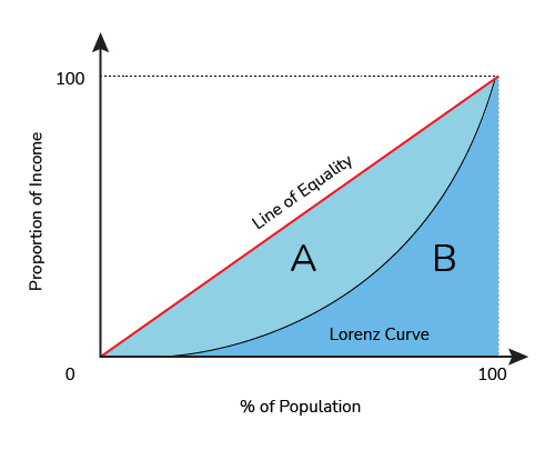
To start looking at measuring inequality we can survey a population, rank people based on their wealth, and compare the percentage of people poorer than a given person to the percentage of wealth held by people poorer than that person. Effectively, these two values will be identical in a purely even distribution but further apart as the inequality starts to grow. If everyone has the same wealth, then the poorest 20% of the population will have 20% of the money, and the poorest 70% will have 70% of the money. If we plot this, we’d get a straight line of equality:


A more unequal distribution might look like this, though, where the poorest 20% only has 5% of the wealth, and the poorest 70% only has 50%:


The Gini coefficient compares these two curves, the equality curve and the actual curve of the population, by comparing the area under the actual curve (B) to the area between the curve and the line of equality (A). The bigger the area between the curves (Area A), the bigger the Gini coefficient, so a Gini of 0 means a perfectly equal society, and a Gini of 1 means effectively that all the wealth is concentrated in the hands of one person.
Gini Coefficient Calculator

Gini in a Bottle

The Gini coefficient isn’t a perfect way of measuring inequality, but does a pretty good job. In the absence of social programs like a universal basic income, it’s worth pointing out that there will probably always be a non-zero Gini income coefficient, and that that’s not inherently evil. For instance, people late in their careers tend to make more money than newborn infants, and we’re generally ok with that.

The Gini coefficient also could give the same number to different distributions, if the shape of the curve is different but still results in the same relative areas. This means that overall it’s better as a relative indicator of inequality than a pure comment on the status of a society.

Unleash the Gini

As a very basic example for figuring out a Gini coefficient of our very own, we can take a look at a 10 player “Sit n Go” poker tournament. Following a common model used in online tournaments, 10 players sign up and the winner gets 50% of the pot, second place gets 30%, and third place gets 20%. Everyone else gets nothing, though hopefully has lots of fun too.

If we wanted to plot the curve we talked about before (incidentally, called a "Lorenz Curve"), we could use the information that the bottom 70% (the 7 losers) get 0% of the wealth, the bottom 80% (7 losers + third place) own 20% of the wealth, and the bottom 90% own 50%. Put that all together and we get this graph:

Area A, between the curves, can now be compared to the total area of A+B, and we get a Gini coefficient of 0.76.

Before we get to the actual point of all this, it’s worth taking a second to reflect here. Splitting a population into ten groups and having 50% of the wealth go to the group that's best at poker is no basis for a system of distributing wealth. That's 50% of all cash, stocks, bonds, houses, privately held land, and super yachts. Extending the analogy, even if we were to pretend that the "best" 10% is who ends up with half the wealth, where here poker ability might correspond to concepts like hard work, diligence, education, etc, that still feels raucously unfair to end up with a distribution as shown above. And that's ignoring the fact that a significant proportion of wealth is significantly correlated to the wealth of one's parents, negating a lot of the 'hard work' argument.

So here's the issue. The Gini coefficient for the distribution of wealth in a 10 player online poker tournament is 0.76. The Gini coefficient for the distribution of wealth in Canada is 0.73.

Now on the one hand, admittedly there's a little bit of room between 0.73 and 0.76. 0.76 is about the same relative inequality as in Vietnam, a bit worse than a country like Egypt (0.756) and a bit better than a country like Bolivia (0.764).

On the other hand, Canada is about the same as countries like Uganda and Liberia, which may come as a surprise to some overly self-righteous Canadians. As well, the most recent statistics are from 2019, and studies show that inequality has only risen during the Covid-19 pandemic.We very well could be worse off than if our society had been set up as though by poker tournament.

Another thing to mention is that, as I said before, the Gini coefficient doesn't really comment on the shape of the Lorenz curve, just the area. And obviously Canada doesn't have 70% of people with absolutely no wealth, so maybe while the numbers are similar they don't mean the same thing, maybe it isn't quite as dire as it sounds?

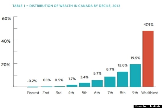
Unfortunately it's not that simple. A 2012 report from the Broadbent Institute showed this graph for Canada:
wealth concentration canada 

Shockingly, the top 10% (at that time) ended up with almost half the wealth, not far off from the poker example. The bottom 10% didn't just have “no wealth”, they owed more than they owned. I'd argue that if you want to think about just how rich the rich are in Canada, a 10 person poker tournament is, distressingly, actually a very good analogy.

As an aside, at least in terms of poker analogies, things can always get worse. The $10,000 Main Event at the World Series of Poker handily posts its payout table online, and if you do a similar analysis you get something much much worse: 

This Gini coefficient comes in at a whopping 0.94, thankfully much higher than any real country. This is what a Lorenz curve looks like when 0.5% of the population has 50% of the wealth, and is genuinely terrifying to contemplate as a future if we don't sort things out in the real world.

Canada has a long way to go in terms of wealth inequality, but obviously it gets worse too. The United States (0.852) and Russia (0.879) have absurdly high wealth inequalities. But worst of all? The world as a whole, sitting at a Gini coefficient for wealth distribution of 0.885. We have the means to measure this and the tools to do address it, and it's well past time we do something about it.

Wednesday, June 30, 2021

Voting Patterns for Edmonton City Council's 2017-2021 Term

City Council, unlike other levels of government, doesn't rely on party systems for categorizing its members. That being said, there still can be, and in fact are, patterns in how members of council vote, and with the Open Data that's available on council voting records, these patterns can be examined.

There are a lot of different ways to visualize voting patterns, and I've played around with these before (see here and here - unfortunately, since most of the visuals for this blog relied on the now-dead Google Fusion Tables, there's really not much to see). I've settled on three favourite methods for the 2017-2021 Edmonton city council term - let's take a look!

First of all, as in previous years, I've disregarded all motions that were unanimous as they provide no particular differentiating information. That leaves the 2017-2021 term with 921 non-unanimous votes to examine (at time of writing).

The first pattern-finding method I like to use it to simply look at the success rates of each member of council. How often did a vote go the way they wanted it to? This can be a sign of consensus-building, or an indicator of work put in behind the scenes (perhaps at other committees), or potentially a matter of being a part of a majority bloc that tends to vote similarly:


While a direct comparison is perhaps unwise, these number in general follow the same pattern as my similar 2016 analysis. Of members of council who were present both years, Councillor Esslinger and Mayor Iveson are again the top two and Councillor Nickel is again the lowest. Councillors Walters, Knack, and Henderson are all within 5% of their 2016 results as well, with Councillor Caterina showing a slightly larger difference from before.

This of course is not intended to imply anything about the effectiveness of individual members of council, and is performed without a review of the motions themselves (whether they are procedural, multiple readings of the same bylaw, etc.).

Noteworthy from the last analysis was the result that Mayor Iveson had only 'lost' 17 votes out of 358 non-unanimous motions in the previous term. For comparison, at the time of writing, this number is now 94 votes.

A second pattern-finding visualization is how often members of council agree with each other. For the 2017-2021 term so far, that is:


The result from this analysis shows that a group of six members of council agree with each other more than 80% of the time across all pairings, and that a seventh member (Councillor Henderson) is just outside with a 79% minimum agreement rate (with Councillor Hamilton). With a council size of 13, seven members is a winning majority on most motions. Certainly, there is a correlation between the top six council vote winners and this group of six members of council - whether this group is ideologically similar or just more likely to compromise and build consensus is beyond the scope of this analysis though!

A third and final pattern-finding visualization that I quite like is adapted from the NOMINATE system used to scale members of the United States Congress. It is intended to represent ideological similarities and differences between members of council in a spatial manner - members closer to each other agree more, and further apart agree less frequently:


I'd like to stress at this moment that, as it's often tough to assign traditional political ideologies to city council bylaw amendments, this graph does not necessarily represent traditional 'left vs right wing' traits, nor traditional 'authoritarian vs libertarian' traits. The results of the graph are intended to model councillors as though their decisions are made based solely on two non-correlated factors, and the model above is oriented with the most significant factor aligned along the x-axis. 

It's totally cool if you want to stop now, but I actually really love this model system and I want to talk about it a bit more since it gained some interest when I did this for London. Effectively, the NOMINATE system models both councillors and motions along the two axes, then assigns a probability of each councillor voting one way or another based on the relative proximity to each "side" of a debate. The algorithm then iterates thousands of times, tweaking the positions of each councillor and motion in such a way to optimize the probabilities of each decision.

The net result of this is that, using only two dimensions, this use of the NOMINATE algorithm as it stands currently accurately assigns the correct vote to each councillor 93.4% of the time. While to some of you this may not seem perfect, a model that reduces the complexity of council decisions to two factors with over 90% accuracy is something I'm quite astounded by and happy with.

For instance, last week's vote to end the mask mandate effective July 1st broke down like this based on the model. Here, the orange coloring indicates 'voted no', and blue indicates 'voted yes', with clear circles for the locations of the decision-points:


Here, the percentages are the model's prediction at the odds of each councillor voting the way they did. The "yes" and "no" points are shown, and the dashed line indicates the mid-way point between the two positions. In this case, the model managed to accurately capture each member's vote (where accuracy here is defined by a yes vote with more than 50% probability, or a no vote with less than 50% probability). The probability doesn't necessarily reflect the difficulty a given member of council had in making their decision, and is more of the measure of accuracy of the model. 

By looking at all votes together, the model slowly hones in on the best placement for each member of council. Not all votes are as clean cut as this one - for instance, the vote on the solar power plant at EL Smith looked like this:


You can see here that the model was very close with councillor McKeen, and effectively swapped Caterina and Dziadyk. Again, as the model is probabilistic this doesn't mean it got these 'wrong', more that having these councillors and decision points in these locations is optimized over the entire term.

It's not a perfect model, but again I'm quite pleased with how accurately it is able to capture the voting term in only two dimensions!

So that's it - three different ways to look at the data, showing different aspects of what can be learned from it!


Monday, June 28, 2021

Which Edmonton City Councillor are you?

I've done this before, and had so much fun with it that I'm happy to once again present: 

A Buzzfeed-style quiz to get you more in touch with your elected representatives!

(it's totally ok if that doesn't excite you as much as it excites me)

Without further ado, here is a quiz for you to play around with. All decision points in the quiz are pulled from real votes in the 2017-2021 city council term, with information and sources provided.


Hopefully that was fun!

Like I said, I've done this before for Edmonton and London, and London was far more excited about it. The work that goes into these is an interesting mix of politics, whimsy, and data work.

The first step is to analyze the City of Edmonton open data set for Votes and Proceedings. For no discernable reason, the data set this term is inconsistent and halfway changes how votes are recorded, as well as changing how councillors are named. It's not particularly tricky to deal with, but it did have to be massaged a bit to be in a consistently usable format.

For this quiz, there's not much point in looking at unanimous procedural votes, so I focused on the 921 (at time of writing) non-unanimous votes. In an ideal world, a set of yes-no choices should require four or fewer questions in order to neatly sort into 13 possible answers (assuming approximately even splitting at each decision point). However, it's much more interesting and easy to answer the quiz when the questions are relevant and engaging. 

Most of the examples I chose for this quiz have news stories attached, which in my mind was a sign of that I'd found adequately interesting votes to base this on, and as a result a user on the quiz can get to a councillor with anywhere from three to five questions, which I was satisfied with. 

Hopefully you are too, because at one point in the design of this quiz one of the leading optimal votes was "That City Council waive the rules on providing notice of motion as set out in section 32 of Bylaw 18155 - Council Procedures Bylaw to allow Councillor S. Hamilton to make a motion without notice regarding the aerial mosquito program." It would've made things work so well but, well, it's hard to really care about it.

Each of the final results in the quiz genuinely leads to member of City Council who voted in the same unique way as the answers you provided. One assumption was made, which was that while Mike Nickel did not vote on his own censure, it was assumed that he would have voted no if he was forced to. 

Hope you had fun!

Saturday, April 27, 2019

Which London city councilor are you?

Open data can be used for a lot of things, and public meeting minutes of elected representatives are crucial in holding representatives accountable, ensuring they represent their constituents, and promoting honesty and efficiency in our government.

Or they can be used to make Buzzfeed style personality quizzes. That's what I did.

We've now hit a point in the City Council meeting minutes from this council so far where all councillors have disagreed with eachother on interesting votes at least once, which allows us to strongly differentiate between them. By presenting some of these votes, we can narrow down a few key motions that separate all the councillors, and present it in a Classification Chart. Since that's not as fun as a quiz, though, here it is in quiz format.

Share widely, and tell me who you got! (It may take a second to load)


Monday, April 22, 2019

Alberta 2019 Election Post-mortem

Well that was fun!

How did I do?

For more than a year now I've been tracking Alberta election polls with the hope of developing a reasonably accurate prediction model. Overall, I'm happy to report that the party I predicted in the lead won in 80 out of 87 races, and my riding qualifiers broke out as follow:

  • "Solid" lead: 65/65 (100%)
  • "Likely" lead: 12/15 (80%)
  • "Lean" lead: 2/5 (40%)
  • "Toss-up" edge: 1/2 (50%)
I think this is a decent proof of concept, small "lean" sample size notwithstanding, and I want to talk a bit about what went right and what went wrong, and how I can improve if I want to keep doing this sort of thing.

First of all, the polls leading up to election day didn't turn out to be too accurate. Take a look at the province and regional splits:


Edmonton was remarkably accurate, Calgary was close, but the rest of the province and the top line results were off significantly. This is possibly a cause for concern, as it could suggest that my model was taking inaccurate data as inputs but then claiming credit for an accurate output, which it wasn't designed to do.

The NDP ended up under-performing relative to their polling numbers, and likely the only reason this didn't mess up too many election prediction models is because they under performed mostly in areas like rural Alberta, where they were predicted to lose anyway. If the polls had been that wrong about the NDP in Edmonton, say, the predictions could have been far worse.

Similarly, my model and others like me likely wouldn't have fared too well if the NDP had overperformed their polling rather than underperformed. The same amount of polling error as actually occurred, applied the other direction, could have had the NDP win the popular vote across the province.

My takeaway from this is that I need to adjust my topline polling tracker. Right now it runs under the implicit assumption that errors in individual polls will cancel each other out. This seemed reasonable given that polls are produced by different companies with different methods. That led to my full Alberta tracker having a low confidence interval for the NDP in particular, though, as several polls in a row provided the same result. If I instead make the assumption that at least part of the polling error is correlated between polls, perhaps due to something beyond their control, then the final result from election night would have still been a surprise, but far less of one. Certainly something I'll take into account next time.

Other Metrics


Overall on a riding-by-riding level, I had an error of 6.4% vote share. That's not superb, but also not far from what my testing beforehand suggested, and was factored into my uncertainty. Comparing my final projection to actual results on election night doesn't look too bad:


If we ignore the Alberta Party and the Liberals, this leads to an overall R-squared value of 0.79, which I consider respectable. It's handy to ignore the low parties because they don't have much of a spread, and will skew the coefficient of determination calculation.

Very fortunately for me, if I input the final actual regional results as though they were a poll result, my model does improve. This is a good hint that my model is behaving decently, especially so since this hasn't been the case with all other forecasters.


With the correct Calgary, Edmonton, and Rural results input as large polls, my model improved to 83/87 seats correctly predicted and an R-squared for party support per seat of 0.91. Very encouraging - too bad the polls weren't more correct!

Finally, I also provided an expected odds of winning each seat for each party. It's one thing to count a prediction as a success if you give it 100% odds of winning and it comes true, but how does one properly score oneself in the case of Calgary-Mountain View, where I gave the Liberals (10.8%), UCP (16.2%) and NDP (73%) different odds of winning, and only one (NDP) did?

In this case I've scored each riding using a Brier score. A score of 0 means a perfect prediction (100% to the winner and 0% predicted for all losers), a score of 1.0 means a perfectly wrong prediction (100% to one of the losers), and because of the math, a score of 0.19 for a complete four-way coin toss (I only predicted the four parties represented in the debate).

Overall, I scored a 0.027, which is considerably better than just guessing. It's hard to get an intuitive sense of what that score really means, but it's mathematically the same as assigning an 83.5% chance of something happening and having it come true. Not a bad prediction, but there's room to be sharpened.

How did I stack up?

So like I said, there were a lot of us predicting the election this time around. I've tried to find as many as I can, and I apologize profoundly if I've missed anyone. I've only included forecasts that had either a vote breakdown per seat or anticipated odds of winning each seat for comparison purposes.

I've reported on three main measures (seat accuracy, R-squared per seat, and prediction Brier score), and I'll present as many of those for each forecaster as I was able to determine. Different forecasters win at different categories, so it's not necessarily a clear picture as to which one of us is the "best", so I'll mostly leave room here for interpretation:


I'm not claiming to be the second best, but it's important to note that being best in one measure doesn't necessarily mean best overall. There are also harder-to-evaluate measures in play here - for instance VisualizedPolitics and TooClosetoCall allow you to input poll values to see reactions for yourself, and both improved when given more accurate data (VisualizedPolitics also got to 83 seats accurately predicted, though still with a low R-squared value).

338Canada probably rightly can claim to have been the strongest this time around, but I given the polling errors we were faced with I think it'll take several more elections to determine if anyone is really getting a significant edge consistently. This isn't the first time we've compared ourselves to each other, and I think it's an important exercise in evaluating our own models and whether there's a need for more.

Thursday, October 25, 2018

London Instant Runoff Breakdown

London (Ontario) just had its first election using instant-runoff balloting. As I've mentioned before, I'm very interested in different forms of electoral reform, so as a new resident of London I was intrigued as to how the vote would work out.

London's system is a bit unusual inasmuch as voters can only rank their first three choices, but otherwise follows a pretty classic Instant Runoff system. Many of the elections resulted in first round winners, and therefore don't have a lot of room for fun analysis, but some of them went deeper and I thought it might be fun to show how the progressed in a Sankey diagram!

First of all, here's Ward 5 (my ward!):


As with all of the following, the leader in the first round ultimately ended up winning. Due to the lack of ability of voters to rank more than three candidates, the number of exhausted votes tends to grow quite quickly after the third round. Interesting patterns include the large number of Clarke supporters moving to Cassidy, and the relatively large number of Knott supporters preferring Warden over Cassidy at the end.

Ward 8
This race ended closer than it began, and likely didn't see any change in leader throughout the race due to the lack of strong trends in down-ballot rankings. 


Ward 9
This race ended quite quickly, with Hopkins getting more than 50% of the vote by the third round after preferential support from Charlebois' supporters.

Ward 12


Similar to Ward 9 - disproportionate support from Mohamed's voters to Peloza secured a win in the fourth round.
Ward 13
One of the tighter races of the election. Kayabaga drew large support from Warren and Hughes supporters, whereas Fyfe-Millar drew more support from Wilbee and Lundquist voters.

Ward 14


Pretty straightforward - along with being the top first choice, Hillier was the preferred alternate for both Tipping and Swalwell's voters leading to a more secure finish than start.


Mayor

(Click to zoom and enhance!)

This one was far more lopsided than all the others. In the early rounds of voting, there was a small amount of jostling for positions 7-9 in the rankings, but apart from that no real changes occurred until Cheng's elimination. No abnormally strong trends in down-ticket voting occurred, though, so Holder held one throughout the end.

The city clerk has promised more detailed information to come out soon, so stay tuned for further analysis!

Monday, September 17, 2018

London City Council

Wow it's been a while since my last post. My apologies!

A principal reason for this is that I've moved - I'm no longer an Edmontonian, and am now a Londoner! London Ontario, that is. This almost definitely means I won't stop posts about Edmonton, but does mean that I'll be increasing my Ontario content.

London is currently in the midst of a civic election, so like any good new citizen to a city my first thought was to learn as much about the current council as I can so that I can make as informed a decision as possible. London's open data is pretty good, but their votes and proceedings aren't as organized quite as well as Edmonton's are.

Nonetheless, with the votes and proceedings that are available, I thought to take a look at council relationships in London in a similar way to how I did in Edmonton two years ago.

Unanimous votes aren't interesting, so I've focused this analysis on the 638 non-unanimous roll call votes as recorded in meeting minutes. First of all, let's take a look at how often each councillor agrees with each other:


Matt Brown is the mayor, and currently enjoys at least 70% agreement with 11 out of 15 councillors, which isn't too shabby. In general, there appears to be a mild bloc of six people (Brown through Park) who all agree quite strongly with each other, another similar block (Park through Hubert) who do the same, and then a handful of councillors who seem to go their own way.

Another sign of consensus-building on city council is the frequency that each member of council has the outcomes of votes in line with how they voted. Again, looking only at non-unanimous votes:


The mayor has been on the losing side of 51 votes out of 610 in which he's been present or not recused, which suggests a reasonable level of consensus building (though not quite as high as Iveson in Edmonton).

If we plot a graph of councillors, and connect them only if they agree at least 67% of the time, we get the following:


The cut-off here was chosen in order to include councillor Turner while still highlighting differences in agreement rates. Unsurprisingly, councillors Turner, Helmer, and Squire are relative outsiders, with a strong cluster of the six councillors mentioned before in the center. Also, this type of graph is incredibly satisfying to play with - enjoy at your own risk!

While showing relative outsiders, this plot doesn't really demonstrate any significant voting blocs. Another way to present the same data is to only connect members of council to whoever they agree with the most often. Doing that results in the following:


Here we get a more interesting structure. Nearly as many people agree more often with councillor Zaifman than Mayor Brown, though there are no separated islands of voting blocs. Only two members of council agreed with each other the most mutually, Matt Brown and Maureen Cassidy, an observation that is provided without further commentary.

The last way I'll look at voting patterns is to scale them using a variant of NOMINATE. This method was developed for analyzing US Congress voting patters, and can assign voting members to a political spectrum without needing to know what the bills being voted on were. For more information, this link is a fascinating read.


Obviously a city council is going to be less partisan than a parliamentary system, but the relative placement of councillors on the graph correlates with how often the agree or disagree with each other, as well as an approximate alignment on issues. I'll detail how this was developed in a subsequent post, but the short version is that each vote is also given a numerical position, and councillors who are closer to the "yes" vote than the "no" vote are assigned probabilities to vote either way. This is then trained against the actual vote data, and thousands of iterations of machine learning later we get this distribution.

Hopefully this has been an interesting glimpse into London city council. Have a fun election!

Friday, June 8, 2018

Ontario Election Wrap-up

The 2018 Ontario General Election is over, and if your team won then congratulations to you!

Over the last month or so I've been tracking the election polls and testing out a few different ideas in order to improve a general model that I'll end up using for the upcoming Alberta election. Of course, I wasn't the only person doing this, and I was able to find at least six other sites tracking and projecting alongside.

But who did the best? Can we learn anything specific about which models produce more reliable results?

First of all, we can look at seat projections. As far as I could tell by mid-day June 7th, this was the seat projection distribution between the seven of us:


CBC Too Close to Call QC125 Lispop Teddy on Politics Calculated Politics Extreme Enginerding Average Actual
PC 78 74 70 69 60 71 70 70.3 76
NDP 45 46 47 50 55 44 45 47.4 40
LIB 1 3 6 4 8 8 9 5.6 7
GRN 0 1 1 1 1 1 0 0.7 1
OTH 0 0 0 0 0 0 0 0 0


Ranking these by the root sum of squares difference from the actual results, we get:

  1. Calculated Politics (diff: 6.48). Their method involved seat-by-seat projections, suggesting a regional breakdown that seemed to work pretty well for them!
  2. Too Close to Call (diff: 7.48). They also provided seat-by-seat projections, and had regional factors involved to project those. Also, most handily, their simulator was interactive, but putting the correct values into it actually made their predictions slightly worse (still second place at 7.87 though).
  3. (Tie: CBC and Me) (diff: 8.12). We ended up with the same predictions for the NDP, but CBC was way under for the Liberals and I was quite a bit under for the PCs. My model didn't involve individual seat projections and instead just approximated historical trends for seat ranges based on party vote share, so that's a win for simplicity I suppose.
  4. QC125 (diff: 9.27). Another site with seat-by-seat projections. The actual seats fell well within their expected ranges, but were all off by a little bit. I'm unsure how they came up with the seat vote projections.
  5. Average (diff: 9.48). In this case, the wisdom of the crowds didn't pan out. 
  6. Lispop (diff: 12.57). Hypothetically they used a regional swing model similar to mine, so I'm not quite sure where the difference comes from here. It looks like they anticipated a much higher NDP voter base than actually happened.
  7. Teddy on Politics (diff: 21.95). It seems like Teddy paid more attention to leader favorability numbers than most of the rest of us, and that seems to have tilted the seat distribution against him. His was the only model to predict a minority government.
For most of the models, the seat projections came directly from the popular vote estimates. If we take a look at those, we get:


CBCToo Close to CallQC125LispopTeddy on PoliticsCalculated PoliticsExtreme EnginerdingAverageActual
PC38.737.937.83837.938.439.838.440.5
NDP35.53636.13736.836.135.935.933.6
LIB19.619.819.71920.919.519.619.719.6
GRN4.94.65?4.54.65.24.84.6
OTH1.31.71.4?01.51.31.41.8

Ranking these again by the same criteria we get:

  1. Me! (diff: 1.15) 
  2. CBC (diff: 2.69)
  3. Average (diff: 3.21) This is a better example of the group as a whole performing better than most individual members. This also probably makes sense as these numbers would have come mostly from the same pool of publicly available polls with a small amount of interpretation for trends and recency, as opposed to a large amount of interpretation as in the case with seat projections.
  4. Calculated Politics (diff: 3.29)
  5. Too Close to Call (diff: 3.56)
  6. QC125 (diff: 3.73)
  7. Lispop (diff: ~4.3) Note that Lispop didn't list their prediction for the green party vote total, despite projecting them to win a seat.
  8. Teddy on Politics (diff: 4.37)
Overall I'm really pleased with how I did, and I've learned a few tricks to use in upcoming elections. Next up will probably be Québec, hopefully with the same group of people, and we can see if this was a fluke for me or not!

Finally, here's my seat model with the actual results input as though they were one final gigantic poll at the end. Using these correct values would have resulted in the model being the most accurate seat projection of them all (diff: 4.24), which is an encouraging sign that the model itself was sound!


See you next election!

Tuesday, April 24, 2018

Alberta Electoral Districts

A few months ago, the Alberta Electoral Boundaries Commission released its report with recommendations on how to redistrict the province for the 2019 election. As I discussed before, this is an important process that occurs every eight to ten years, and is necessary for keeping the provincial electoral boundaries up to date with current population distributions.

As a quick aside, I'd like to thank everyone who, after reading my post on redistributing using the shortest splitline algorithm, actually wrote in to the commission to tell them to do that. Thanks guys!

Redistricting is always a hot topic, as it can lead to accusations of tampering or gerrymandering by those in power. In Alberta the process is ostensibly done by an arms-length body, and as such when the results were unveiled in October the complaints were pretty tame from the parties not in power. The major effect of the redistricting was to merge rural ridings in such a way that three more urban ridings were created.

In 2015, the poll by poll results for Alberta looked like this:


Here, each poll is shaded a darker colour if the party won by 50% of the vote or more. It's pretty fun to zoom around in it!

These polls were fitted to the 2015 riding boundaries, and if we break them out then add the votes back together according to the new 2019 boundaries, we can get a sense of what the outcome for future elections might look like. The process isn't perfect, as not all polls fit precisely into each new riding, but ultimately this is how the 2015 election is likely to have looked under the 2019 redistricting:


This map is coloured the same way as the poll map above.

The impact this would have had on each party is:

  • The total seats won by the NDP wouldn't have changed at 54
  • The total seats won by the Wildrose would have decreased from 21 to 20
  • The total seats won by the PCs would have increased from 10* to 12
  • The Alberta Party would have stayed at 1 seat
  • The Liberals wouldn't have won any
The next election is a little over a year away, and these will be the ridings to be determined in that election. Stay tuned as I work to better develop my seat projection model and poll tracker over the next year!

Monday, October 23, 2017

Edmonton Election 2017

Another election has come and gone, and apart from a handful of new faces the biggest news is all the new stats! Let's take a look:

First of all, turnout was abysmal. A total of 194,826 people voted, resulting in a voter turnout of 31.5%. The best (blue) and worst (red) areas of the city in terms of voter turnout are shown here:


The colouring of the map is a bit funky since the mean and median are rather far apart, but it gives a decent impression of what happened. In general, it looks like neighborhoods around the river valley voted more often than neighborhoods away from it, which is interesting. The massive difference between the high (66.9%) and low (9.3%) turnout is absolutely astounding to me, and might suggest fairly significant challenges with connecting with voters in certain areas (especially if they can't see the river, apparently...).

Voter turnout can also be measured in a few other ways, including attrition along the ballot. For instance, of everyone who voted, 1.5% neglected to vote for a mayoral candidate, and 1.9% neglected to vote for any council candidate. 26.3% of voters picked a Catholic schools ballot vs. 66.6% Public ballots, and even then 6.5% of Catholics and 9.8% of Publics didn't end up voting for a school trustee anyway. Oddly enough, the total number of Catholic + Public voters doesn't equal the total number of voters, so I'm not entirely sure where the remaining 7.1% of voters did for school board...


Lighter colours represent 'under votes', or people who didn't make a pick for that particular round of voting.
Don Iveson was re-elected mayor with a solid victory. His support levels in Edmonton aren't dissimilar from last election, and are shown here (darker colours meaning higher support).


Iveson's support in general seems very solid in the center of the city, and a bit weaker in the north and southeast than the rest of the city. All that being said, his support ranged from 59.5-85.9% so he has a strong mandate from every part of the city.

Finally, similar to last election, I've taken a look at which councillors' support correlates most or least with the mayor's. Last year, it turned out that a general pattern emerged where the councillors whose support most often correlated with high mayoral support also generally agreed with the mayor on votes. This year, the correlations between councillors and the mayor are:


I'd say this supports the theory from last election - last term, McKeen, Esslinger, Knack, Walters, and Henderson all voted alongside the mayor on more than 80% of non-unanimous votes, while Banga, Caterina, and Nickel (76%, 75%, and 46%, respectively) agreed with the mayor less frequently. While the mayor has had a strong track record of gaining majority support for non-unanimous bills, it does seem as though the candidates who do better in polls where the mayor does worse to tend on average to disagree with him more often than not.

That suggests that perhaps this council will be a little bit closer in voting record than the last one - the four new councillors all showed up in the middle of the pack for mayoral correlations, so likely either they are wildcards for agreement with the mayor, or as new candidates their reputation hasn't yet been tested. Only time will tell!

Monday, June 26, 2017

Edmonton City Council Gender Parity

Back in October I took a quick look at the success rates of female candidates getting into city council. In 2013, 22% of candidates were female, but only one out of the twelve council seats ended up being held by a woman. The aim of that post was to investigate some of the source of the gender disparity on council - namely whether the distribution of female candidates in different races was causing the issue, or whether there was an inherent bias against female candidates.

Ultimately, I determined that the relative lack of successful female council winners was more likely due to distribution of candidates across races than individual bias - without accounting for incumbency, there was no evidence of anything other than relative equal chances of winning between female and male candidates (i.e the number of female winners since 2004 is more or less what you'd expect assuming all candidates are equally likely to win).

That was a pretty positive sign, as it suggests that the biggest factor holding back a demographically-balanced council is the availability of under-represented candidates to run (which is totally outside of the scope of this blog to discuss), and perhaps more importantly, the avoidance of clumping of under-represented demographics into the same few races.

One of the biggest issues with the 2013 election was that five wards had no women running at all, and half of all women were clustered into two ridings. This drastically reduced the expected number of women into council, regardless of the relative proportion of candidates who put their names forward.

So with all that said, I've been keeping track of candidates for the 2017 civic election which are being tracked at Daveberta. For each candidate, I've tried to ascertain their gender in order by how they refer to themselves (political candidates love speaking in the third person), or how they're referred to in third party posts, and if all else fails by name and presentation assumptions. If you notice any errors, please let me know.

(Last updated September 19, 2017)

Based on the current 71 candidates, 23 are female and 48 are male (female ratio of 32.4%, up from 22% in 2013). However, based on the distribution between wards, an expected 3.89 seats will be won by female candidates, which could be considered a relatively inefficient allocation of seats based on the ratio of candidates. wards have no women running at all.

Overall, it's most likely that the number of female councillors after the election will be between 2 and 6 (90% confidence).

Edmonton Council (32% female candidates)


Edmonton Catholic School Board (65% female candidates)


Edmonton Public School Board (39% female candidates)

Now that the official nomination deadline has passed, these numbers ought to be pretty official! All in all, women running for city council are still a bit poorly distributed, leading to an expected under-representation of about 0.15 seats. On the other hand, men tend to be poorly distributed in the school board races, leading to expected over-representations of 0.28 and 0.86 seats for Catholic and Public boards respectively. All in all, the candidate distributions are fairly balanced though, and this is certainly a fairer election gender-wise than 2013.

Tuesday, May 9, 2017

Next Game Wins?

(Subtitle: Which Game Should You Win? Part 3)

Three years ago, my friend Andrew pitched in to the blog and asked which game in the playoffs was most worth winning. The results were a bit inconclusive, but from it he developed a database of all playoff outcomes since 1943, so a year later I looked at the dataset again and developed Markov-style chains of playoff odds based on different positions in the playoffs.

Now that it's playoff season again, people are naturally interested more than normal in hockey and I recently overheard someone comment that, though a series was currently at 2-1 for wins, the next team to win was undoubtedly going to win the series.

Good thing I have this handy database of all playoff outcomes ready, because that immediately intrigued me as to how likely it actually is that, at any given point, the next team to win a game will win the series overall. This is perhaps another way of asking the same question as before - how much does this upcoming playoff game matter to the grand scheme of things?

Before looking into the historical data, though, it's worth doing the math to see what the odds would be if the human element were removed (with all games having a 50/50 chance of going either way, and all games being independent). Obviously, if a best-of-seven playoff series is tied at 3-3, then the next game winner is guaranteed to win the series, so that's an easy starting point.

From there, it's not too hard to work backwards to figure out the rest of the odds. If a series is at 3-2, then there's a 50% chance that the leading team wins (which would give them the series win, and a 100% chance therefore of winning the series), and a 50% chance that we get to a 3-3 position, where the chance of the trailing team being the overall winner is again 50%. Overall, that makes the chance that the next game winner will be the series winner (50%*100%)+(50%*50%)=75%.

If we continue this way, then we can generate this table of values. For all following graphs, the 'home team' is the team that has home town advantage for the first two games:


So what's not surprising here is that the odds that the next team to win will be the series winner are always above 50%. That makes sense, because no matter what the position is beforehand the winner is improving their overall odds of winning the series. What's more interesting is how little games tend to matter when the series is lopsided.

Of course, games aren't all independent or aren't all 50/50 toss-ups. Historically, home teams win 54.5% of games, so let's see what happens if we recreate this table with that factored in. It's a bit more complicated, but essentially the same analysis as before, to get this table:


Here we start to see the effects of the playoff structure and the pattern with which it allocates home games to different teams. For instance, when the original home team is up 3-0, the upcoming game almost doesn't matter at all, but the situation isn't quite the same if the original away team is up 3-0. Similarly, both 3-2 game situations have different values. This can be perhaps more easily rationalized - if the original home team is up 3-2, then the upcoming game is going to be in their opponent's home town, which makes it more likely that that other team will win, but if they do then it's tied coming back home, so that's less of a big deal. On the other hand, if the original away team is leading 3-2, they're more likely to win this upcoming game 6, and can lock the series up right there.

Of course, this is all fun and games from a theoretical point of view, but what's actually been happening in real playoff series? Here we go:


This is definitely more interesting! Here we have a clear outlier from the theoretical projections from before, where the 'least important' game is game 5 when the original away team is up 3-1. At this point, the original home team would be playing back at home, but would be down by such a significant deficit, resulting in a situation where they end up with a fairly high 'last hurrah' win rate, before ultimately losing the series 2-4.

On the other hand, there's a surprisingly high predictive score for whoever wins the game after the original home team gets up 1-0, at 74% (8% higher than what you'd expect in a coin toss scenario). I imagine this indicates that the original home team is likely to win their first game, and that if the original away team can't bounce back then the series is likely sorted out by that point (at least, in harder-to-quantify matters than you'd expect).

So the answer to the question 'which playoff game is the most important' remains a solid "it depends", but now you have three different ways of looking at the question. Use them wisely, and enjoy the 2017 playoffs!

Monday, February 6, 2017

How often does the best team win the championship?

Imagine we have a four team single-elimination tournament. Team A is good enough that you'd expect them to win about 80% of all games, Team B ought to win about 60%, Team C should win 40%, and Team D ought to win about 20% of games (against random opponents). If we seeded a single elimination tournament with these teams, it could look something like this:


Given the information above, how likely is it that the best team in this tournament, Team A, ends up being the winner? In other words, how effective is this tournament structure and seeding system at determining the best team out of the four?

The first tool we'll need for this is the Log5 formula - given the true winning percentages of two teams, this formula tells you the odds of a given team winning. So for instance, Team A playing Team D is pretty lopsided, and Team A has a 94.18% chance of winning that game based on this formula. Similarly, Team B and Team C are much closer in relative skill, so Team B only has a 69.23% chance of winning that game.

Based on all of this, we can come up with the relative chances of any of the four teams winning the tournament overall:


So in our hypothetical situation, this single-elimination four-player seeded tournament with known team skillsets resulted in the best team, Team A, winning 72.26% of the time, and the worst team winning 1.06% of the time. Not shabby.

However, what if you didn't know the skill levels of the teams going into the tournament? How confident could you be that the eventual winner of the tournament was, in fact, the best team when they signed up? One way to determine this is by running a Monte Carlo simulation - let's sign up four teams of random skill values, run them through a tournament exactly the same way as we just did with our sample teams, and see who the winner is. Then let's do that 10,000 times, and see how often the best team wins.

The results are interesting: with randomly drawn skill values for all teams (mean= 0.5, stdev=0.13 [see below**]), we'd expect the winner of the tournament to be the strongest team only 44.3% of the time. About 10.5% of the time, the weakest team in the tournament would end up winning the whole thing!

So is a single elimination tournament a particularly good way of determining the best overall team from a pool of four teams? Probably not. What happens if we up the ante, and have a double elimination tournament? Double elimination tournaments are exactly what they sound like - any given team needs to lose twice before being eliminated. They tend to look something like this:


This sort of format ought to improve the chances of the best team winning, as a single unlucky (and unlikely) loss won't eliminate them too early. If we run the same sort of analysis, but with a double elimination tournament, we end up with the winner being the strongest team 51.1% of the time, and the winner being the weakest team only 7.7% of the time. A reasonable improvement all in all.


Unfortunately, this modest increase in chances of determining the truly best team is offset by the increased length and uncertainty in the tournament. A single elimination tournament needs three games total, whereas a double elimination tournament needs either six or seven games, depending on how the sixth one goes. This is also annoying to schedule and sell tickets for, as organizers have no way of knowing if the sixth game will be the exciting final or not.

Expanding a bit, we can do the same analysis with single, double, and triple (!) elimination format tournaments for tournament of as many teams as we want. Before we continue, though, I'll mention that for a 32 team single-elimination randomly-seeded tournament, the odds that the winner will have been the best team overall are 22.0%. Keep that in mind.

So why talk about these tiny little tournaments? It's to get you ready for the real deal: professional sports.

Professional sports leagues generally tend to fall into a regular season and playoffs, where the regular season is used to seed teams into some sort of order and filter out the best, who end up playing in a tournament bracket of one style or another. What happens if we do the same sort of analysis for each major (and some minor) sports league?

National Basketball Association

Overview: 30 teams play 82 games each in the regular season. Teams are sorted into conferences and divisions. The playoffs are a 16-team single elimination tournament bracket, where each round of the playoffs consists of a best-of-seven games series for elimination. Teams are seeded within conferences, and the bracket is fixed at the end of the regular season. This gives us:


Overall odds of the NBA Championship being won by the season's best team: 45.9%.

Pros: Best-of-seven series in playoffs reduces variability in results. Not seeding teams based on division standings, and only looking at conference standings, reduces the chances of weaker teams getting into the playoffs by virtue of leading weaker divisions.

Cons: Relatively long season for regular season, large range in potential length of playoffs.

National Hockey League

Overview: 30 teams play 82 games each in the regular season. Teams are sorted into conferences and divisions, and are more likely to play teams inside their divisions and conferences than outside of them. The playoffs are a 16-team single elimination tournament bracket, where each round of the playoffs consists of a best-of-seven games series for elimination. Teams are seeded within divisions such that the top three teams of each division are guaranteed a spot in the playoffs, and the highest-performing two teams of the conference that remain get in as wildcards. All of this results in the following distribution:


Overall odds the Stanley Cup winner was the season's best team: 45.4%.

Pros: Best-of-seven elimination in playoffs reduces variance and increases the chances of better teams triumphing.

Cons: Relatively long season for regular season, large range in potential length of playoffs.

Fun fact: Only real difference between NHL and NBA results is the seeding into the playoffs and how wildcards are handled, and that results in hardly any change at all.

Major League Baseball

Overview: 30 teams play 162 games each in the regular season. Teams are sorted into leagues and divisions, are are more likely to play teams inside their divisions and leagues than outside of them. The playoffs consist of the winners of each division and the two wildcard runners-up from the conference, and is a wonky sort of 10-team single elimination tournament where the first round are two single game wild-card playoffs, followed by four best-of-five division series, then two best-of-seven league winner series. Finally, the winners of each league play each other in a best-of-seven series to determine the winner. From this, we get:


Overall odds the World Series winner was the season's best team: 45.4%.

Pros: Teams are more likely to be correctly seeded heading into playoffs due to extensive regular season. Fewer teams in playoffs makes it less likely for weaker teams to get lucky.

Cons: Short playoff season with sudden-death games and best-of-five series increases variance.

Fun fact: If all rounds (including wildcard) in the MLB playoffs were best-of-seven series, the odds that the winner was actually the best team increase to 46.4%.

National Football League

Overview: 32 teams play 16 games each in the regular season. Teams are sorted into conferences and divisions, and are more likely to play teams inside their divisions and conferences than outside of them. The playoffs are a true 12-team single-elimination tournament, where each division leader and two runner-up wildcards are seeded from each conference. This results in:


Overall odds the Superbowl winner was the season's best team: 28.2%.

Pros: Short, fixed playoff schedule is predictable.

Cons: Single elimination sudden death games greatly increase the chances of weaker teams winning by chance and eliminating stronger teams. Relatively short season also doesn't guarantee accurate seeding of teams heading into playoffs.

Fun fact: Before, I mentioned that the chance of the winner of a randomly-seeded 32-team single-elimination tournament being the best team was 22.0%. That means the NFL season format isn't really all that much better than just having one six-week March Madness style showdown each season.

Some more minor tournaments that are still near and dear to my heart:

Canadian Football League

Overview: Nine teams play 18 games each in the regular season. Teams are sorted into two divisions. The playoffs are a single-elimination 5-team tournament, where the highest-ranked team in each division gets a bye to the division finals. Teams can cross-over into other divisions if the fourth-place team in one division has more points at the end of the regular season than the third-place team in the other division. This gives us:


Overall odds the Grey Cup will go to the season's best team: 38.0%.

Pros: Short, fixed playoff season is predictable. Still somehow have a longer regular season than the NFL. Higher ranked teams getting a bye to the division finals helps out the stronger teams.

Cons: Single elimination playoff format, which includes more than half the league, leads to a bit of a crapshoot. It's disappointing than the NHL with over four times as many teams is better suited to finding its best team each year.

Fun fact: Again, this isn't substantially better than just running a 9-team randomly-seeded single elimination tournament right at the beginning of the year. It's more fun, though.

Curling

Overview: Major curling tournaments involve 12 teams, who play each other once each in a round robin. The top four teams are seeded into a Page playoff system, where the top two teams are in quasi-double elimination system, and the remaining teams are in single elimination. This gives us:


Overall odds the winner was the tournament's best team: 37.3%.

Pros: Fixed playoff system is short and predictable. Page playoff system gives a bonus to the teams who perform best after a fair and balanced round-robin.

Cons: Single elimination format of playoffs increases variability.

Fun fact: Curling is fun and you should try it.

So there you go. Unsurprisingly, sports leagues with longer regular seasons and best-of-seven playoff series are better suited for determining the actual best teams each season, whereas leagues with shorter seasons and single elimination tournaments as less well-suited. Now you have numbers to show for it, at least!